One of the worst kept secrets in baseball is officially out.
After months of speculation and several leaks, the Red Sox officially unveiled their new Fenway Park themed City Connect uniforms on Friday afternoon. As has long been expected, the new uniforms are green and incorporate numerous nods to the Green Monster and the ballpark as a whole.
The uniforms are set to make their on-field debut in Friday’s series opener against the Atlanta Braves, and they will be worn again in next Friday’s game against the Baltimore Orioles as well.
The Herald and other outlets were provided an early look at the complete uniforms under an embargo that lifted Friday afternoon. Troup Parkinson, chief marketing and partnerships officer for the Red Sox, said the new uniforms have been in development for two years and that they knew early on that they wanted to make the design Fenway-centric.
Parkinson also said they felt strongly that the color had to be exactly right, and that he believes the new uniforms will be received in a similar way the original yellow City Connects were.
“We really tried to create something that everyone, not only externally but internally, can be really proud of,” Parkinson said. “We feel like this was a great direction and a fun direction to go with a super authentic story, which is kind of our thought on the first City Connect we did.”
A familiar look
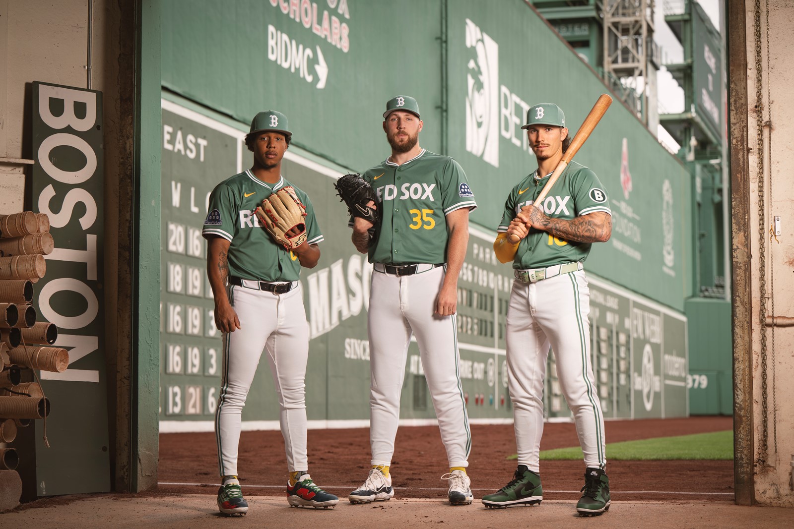
The new uniform is the exact shade of green as Fenway Park, including a matching hat to go along with white pants. The jersey top features the words “Red Sox” across the front in white in the same font as the Green Monster scoreboard, along with yellow front numbers and a yellow Nike swoosh to match the scoreboard’s running line score and the foul poles.
The front numbers are a departure from Boston’s typical home look, which have historically only featured numbers on the back.
The jersey sleeve includes a circled “B” logo matching the hit and error lights on the scoreboard, and the numbers on the back are notched on top to match the Green Monster’s score and number plates. The inside collar is grey, mimicking the concrete interior structure of the Monster, and is adorned with 1912, the year Fenway Park first opened. The jersey’s jock tag also features a series of green and red dots, matching the balls, strikes and outs lights from the scoreboard.
The hat is essentially a standard Red Sox cap, only colored Fenway Park green with a white “B,” and the pants are white with a green double stripe down the sides. The socks, which were not featured in the deck provided to the Herald, are expected to be mostly green with yellow and grey elements as well.
Parkinson said the club didn’t want to get carried away with too many design elements and that they ultimately wanted to prioritize making a clean looking uniform that could be worn more than once.
“I think we self-edited well,” Parkinson said. “I think you can kind of go a little crazy sometimes and you get locked in to just adding little pieces or making the eyelids on the hat a different color because wouldn’t that be fun. We stopped that, which I think is good.”
Positive initial feedback
Anyone paying attention likely wasn’t surprised by many aspects of the reveal. Rumors have swirled for months that the uniform would be green, rumors that Red Sox CEO Sam Kennedy confirmed in an appearance with MassLive’s Fenway Rundown podcast in which he also alluded to the Green Monster theme.
Then about a month ago the Red Sox uniform leaked on social media along with several other teams’ soon-to-be-announced City Connects, each of which were subsequently confirmed to be legitimate. But the leak only included the a Red Sox jersey top with no front number, and it wasn’t until retail jerseys began turning up at local stores over the past week that the yellow numbers were revealed. The hat and pants remained under wraps until Friday’s announced.
Parkinson said the leaks were unfortunate, but from the team’s perspective it wasn’t the end of the world.
“You don’t get the full picture, right? I think this jersey is amazingly different when you have yellow numbers on the front versus no numbers on the front,” Parkinson said. “So even the leak that came a month ago that leaked a bunch of them, I was like great, that’s not even our jersey, that’s not even the full offering, you’re missing so many elements, for us the yellow numbers on the front make a huge difference, the pants make a huge difference.”
Given that many fans have already seen portions of the new uniform, what kind of feedback has the club gotten so far?
“It seems like it’s been pretty positive,” Parkinson said. “I feel like really early on when it was talked about that we were going to have one of the City Connects this year, I feel like more than a couple of people sort of pitched green anyway.”
Why Fenway?
The idea behind Nike’s City Connect program is to allow teams an opportunity to create new uniforms that draw a connection with their home city and fanbase. Boston’s first City Connect uniform — which the club will continue wearing — was inspired by the Boston Marathon and remains among the most successful City Connect designs.
Parkinson said the club floated about a dozen ideas during the development of that initial uniform but found many of the other possibilities to be light. When it came time to begin work on a second City Connect, he said the path forward was fairly straightforward.
“We felt this was one of the only directions we could go,” Parkinson said. “We felt like this was great for us from a ballpark connection perspective, we felt this was highlighting one of the strongest pieces of our brand. And something the players are connected to, but something all players are connected to that have played here.”
One of the keys to the original City Connect uniform’s success is that the Boston Marathon is among the most unifying cultural events the city has. While Boston has a rich and expansive history it could have mined from for its new uniform, a case could be made that one of the city’s other most unifying touchstones is Fenway Park itself, something the club decided to lean into.
“The marathon look and feel, that’s real. You don’t have to be a runner to get behind that. You don’t have to be a Boston resident to get behind that. You know what it stands for, and I love the colors anyway, but you have to almost be supportive of that concept,” Parkinson said. “I think this is similar.”